The Eye: perception. Interpretation
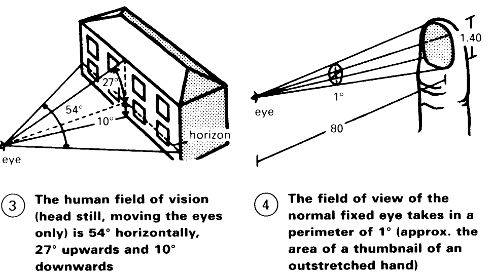
The activity of the eye is divided into seeing and observing. Seeing first of all serves our physical safety but observing takes over where seeing finishes; it leads to enjoyment of the 'pictures' registered through seeing. One can differentiate between a still and a scanned picture by the way that the eye stays on an object or scans along it. The still picture is displayed in a segment of the area of a circle, whose diameter is the same as the distance of the eye from the object. Inside this field of view the objects appear to the eye 'at a glance' - (3).
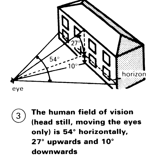
The ideal still picture is displayed in balance. Balance is the first characteristic of architectural beauty. (Physiologists are working on a theory of the sixth sense - the sense of balance or static sense - that underpins the sense of beauty we feel with regard to symmetrical, harmonious things and proportions (-> pp. 27-30) or when we are faced with elements that are in balance.).
Outside this framework, the eye receives its impressions by scanning the picture. The scanning eye works forward along the obstacles of resistance which it meets as it directs itself away from us in width or depth. Obstacles of the same or recurring distances are detected by the eye as a 'beat' or a 'rhythm', which has the same appeal as the sounds received by the ear from music. 'Architecture is Frozen Music. This effect occurs even when regarding a still or scanned picture of an enclosed area - (1) and (2).
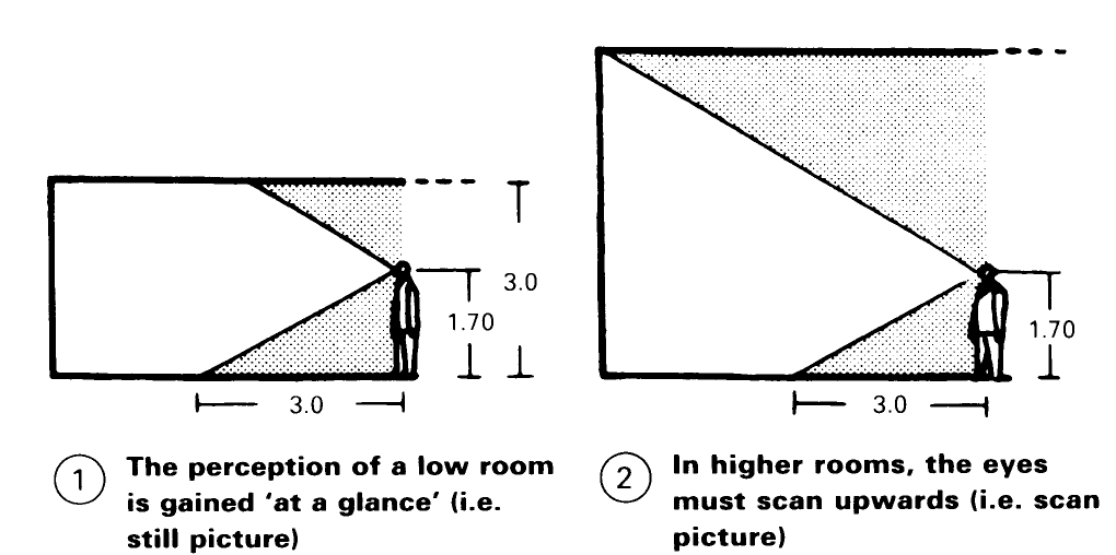
A room whose top demarcation (the ceiling) we recognise in the still picture gives a feeling of security, but on the other hand in long rooms it gives a feeling of depression. With a high ceiling, which the eye can only recognise at first by scanning, the room appears free and sublime, provided that the distance between the walls, and hence the general proportions, are in harmony.
Designers must be careful with this because the eye is susceptible to optical illusions. It estimates the extent of width more exactly than depths or heights, the latter always appearing larger. Thus a tower seems much higher when seen from above rather than from below. Vertical edges have the effect of overhanging at the top and horizontal ones of curving up in the middle. When taking these things into account, the designer should not resort to the other extreme (Baroque) and, for example, reinforce the effect of perspective by inclined windows and cornices (St Peter's in Rome) or even by cornices and vaulting painted in perspective and the like.
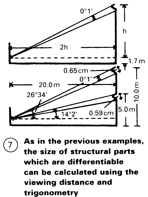
The decisive factor for the measurement of size is the size of the field of view -> (3) and, if applicable, the field of vision – (4) and, for the exact differentiation of details, the size of the field of reading -> (5) and (6). The distance of the latter determines the size of the details to be differentiated.
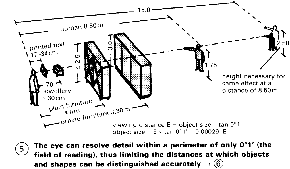
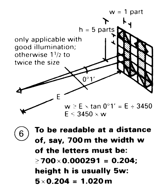
The Greeks complied exactly with this rule. The size of the smallest moulding under the cornice of the individual temples of varying height is so dimensioned that, at an angular distance of 27° - (7), it complies with the reading field of 0°1'. From this also results the reading distances for books (which varies with the size of the letters) and the seating plans for auditoriums etc.
Date added: 2023-01-01; views: 644;
