Correlation, Association, and Hypothesis Evaluation
Geographers frequently make use of correlation and association techniques in order to evaluate their hypotheses. These methods measure the strength of association between a dependent variable and one or more independent variables.
An advantage of correlation methods is that they are easy to visualize. Correlations are estimated using scatter diagrams, which are two-dimensional graphs. On the graph, the vertical or y-axis represents values of the dependent variable, while the horizontal or v-axis represents values of the independent variable.
The researcher constructs a scatter diagram by plotting a dot for each observation on the graph (Figure B1—3). Once all the points have been plotted, their pattern is examined. If the points form a straight line, a high degree of correspondence between the variables is indicated. On the other hand, a random pattern indicates little or no association between the variables, in which case a hypothesis that the dependent and independent variables are related would be rejected.
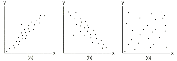
Figure B1-3 A Scatter Diagram. Scatter diagrams may be used to show the correlation and association between variables. In (a) and (b) there is a high degree of correspondence between the two variables. In the case of (a) there is a positive relationship, while in (b) the relationship is negative. There is no relationship between the two variables in (c) as indicated by the random pattern
In some cases, the value of the dependent variable increases as the value of the independent variable increases. For example, increasing personal income is generally associated with increasing levels of education. Highly educated people make more money than those who are not as well educated. When the dependent variable increases as the independent variable increases, the association between them represents a direct relationship. In other cases, the value of one variable declines as the other increases. High incomes are associated with low rates of unemployment. These associations represent inverse relationships.
The strength of the relationship is measured by a statistic known as the correlation coefficient. The value of the correlation coefficient, r, ranges between 1 and —1. A strong direct relationship has a correlation coefficient close to 1. A strong inverse relationship generates a negative correlation coefficient. If there is no relationship, the correlation is zero.
In analyzing and interpreting correlation coefficients, it is important to recognize that correlation does not imply causality. Evidence of strong association between two variables may not be indicative of a cause-effect relationship. At times, researchers discover strong correlations between variables that are actually unrelated. These strong correlations may be the result of a mutual relationship with a third variable, or may be coincidental. The researcher must be careful to identify causal relationships logically in interpreting scatter diagrams and correlation coefficients.
An Application of Geographic Information Systems. In October 1991—two years after the 1989 earthquake — a series of fires ravaged the hills above Oakland and Berkeley, California (Figure B 1-4). The fires burned out of control for three days, killing twenty-six people and destroying nearly four thousand dwellings. The total property damage suffered in Oakland and Berkeley totaled over $5 billion.

Figure B 1-4. Fires in the East Bay. The spread of the wildfires in the East Bay was encouraged by drought and high winds. Geographic information systems have proven useful to local officials in the assessment of damages and recovery from this disaster and preventing the occurrence of similar episodes
As residents of the fire-ravaged cities struggled to rebuild, local government officials expressed concern about the task of debris removal, the possibility of landslides triggered by heavy rainstorms, and the dangers associated with escaping fire-prone areas on narrow, winding streets and roads.
Rebuilding the area and preventing further disasters were facilitated with the use of geographic information systems. The most immediate task was to identify those areas prone to landslides. Maps identifying soil types, drainage patterns, vegetation types, topography, and steepness of slope were prepared and overlaid in order to identify those sections of the region most likely to experience devastating landslides. Places with steep slopes and sandy soils that are devoid of vegetation and located near drainage features are most prone to landslide activity. By identifying such areas, local officials could prioritize the allocation of cleanup and rebuilding revenues and activities.
A second application of GIS to the East Bay fires involved planning responses to future fire emergencies. For example, wood-shingle roofs were blamed for expediting the spread of fires once they burned out of control. Topographic maps were compared to maps showing house distributions, enabling officials to discourage or ban wood-shingle construction in fire-prone areas.
Efficient routes to remove the tons of concrete, steel, and other debris generated by the fires and landslides could be plotted easily, speeding the cleanup process and helping city officials to prevent future disasters. In general, public officials in the Bay Area found that effective use of geographic information could not only improve the process of recovery from the disaster that had just occurred, but could aid in preventing similar disasters, or at least minimizing their effects.
Date added: 2023-01-05; views: 857;